Lead UX Designer: Asha Bhakta 🥳
Developers: Melissa Gabriele, Ajax Abernathy
the story
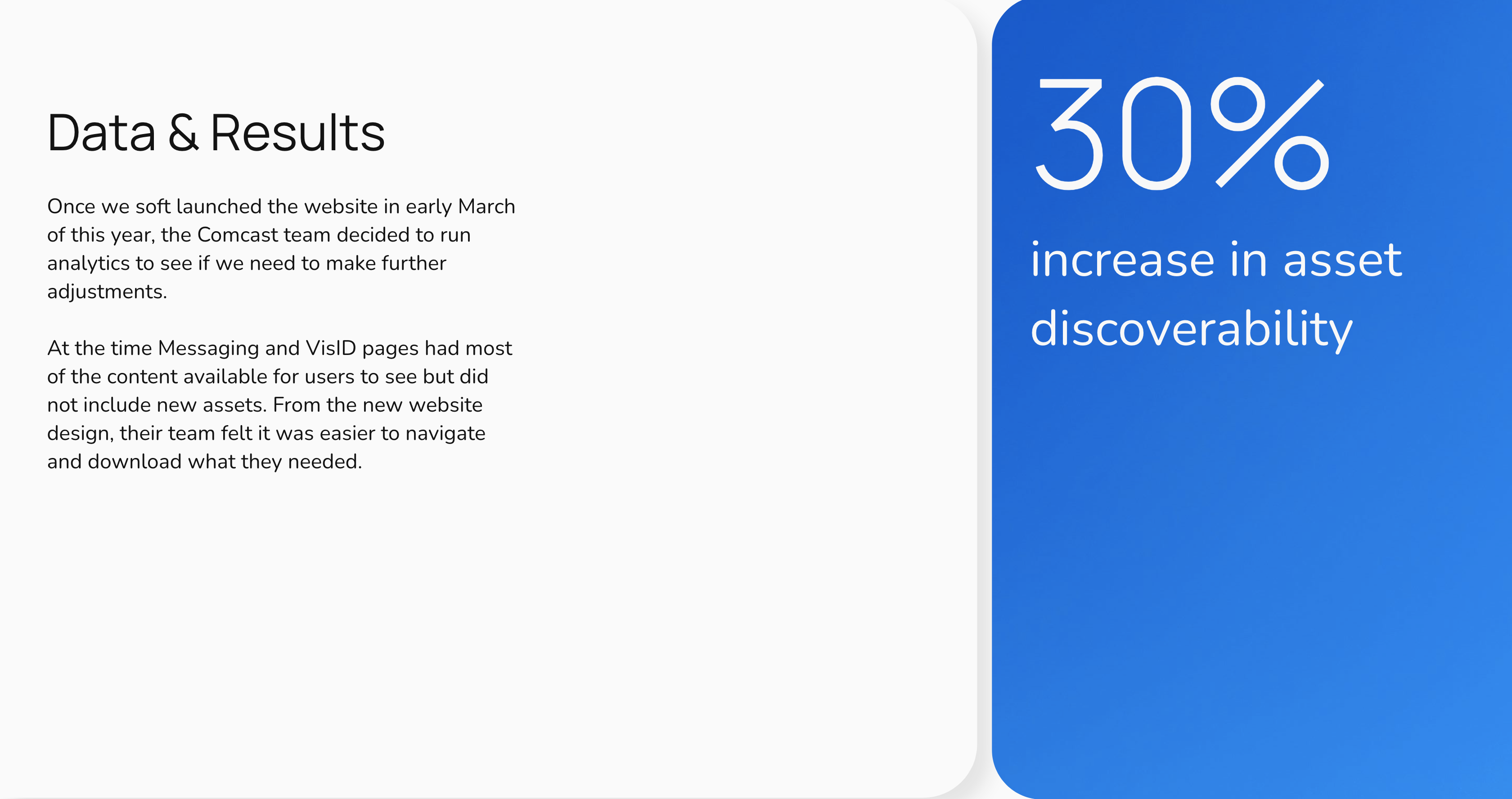
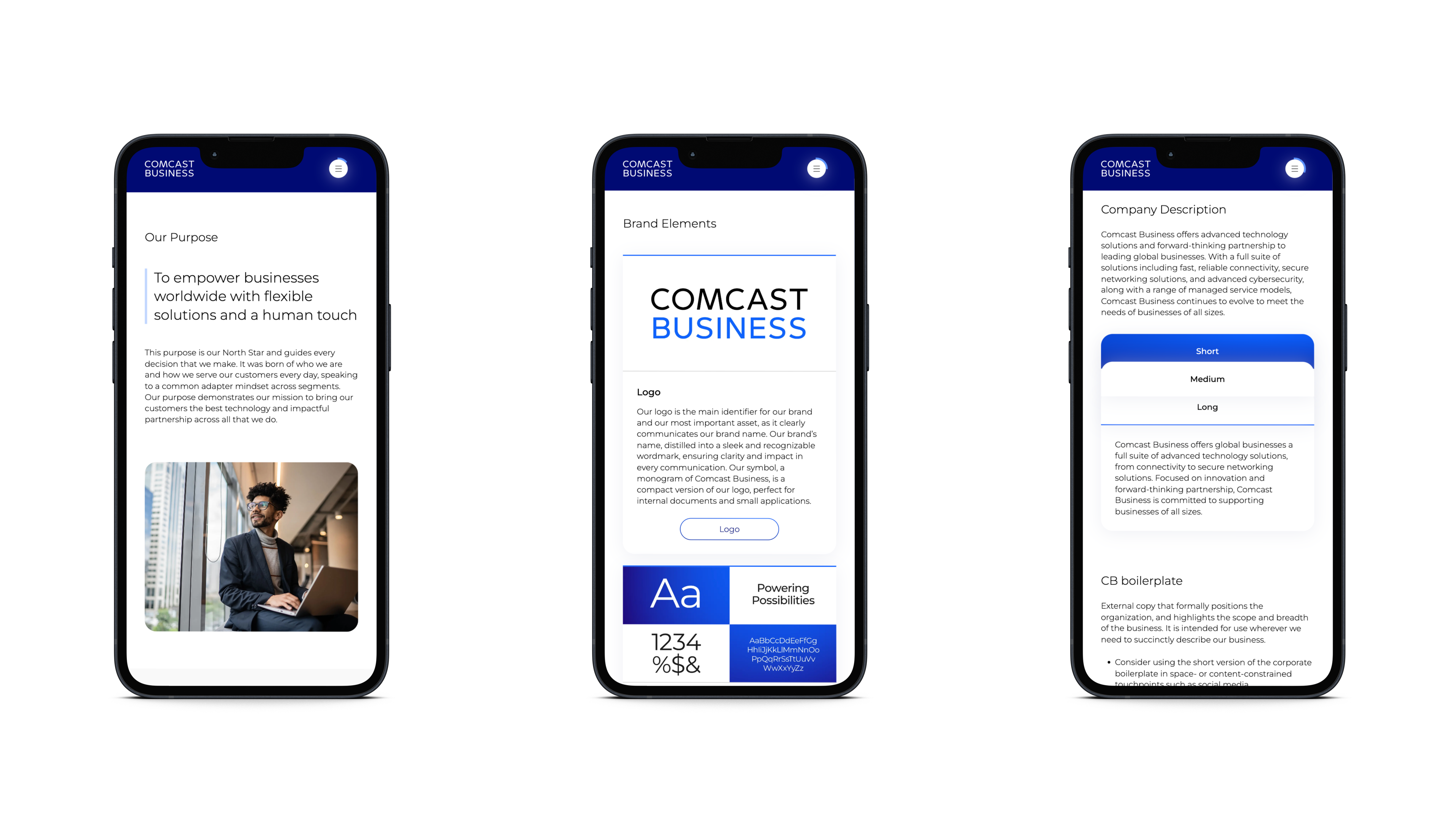
To streamline access to Comcast Business’ brand guidelines, I led the design of a new website that consolidated key resources and assets in one place. This eliminated the need for users to download multiple PDFs and documents, making brand compliance easier and much more efficient.


Given the depth of content, my goal was to ensure users could:
- Quickly find what they were looking for and navigate throughout the site
- Understand their position within the content and pages
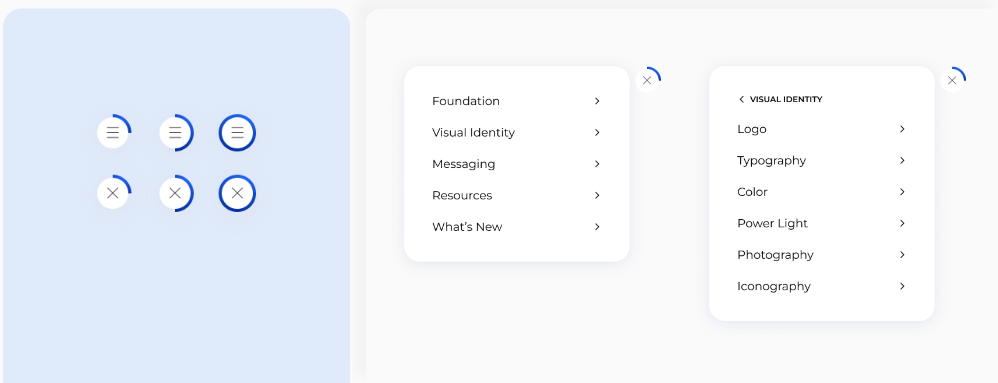
To make navigation simple and efficient, I worked closely with the front-end team to explore and prototype several menu options. We tested each one by timing how long it took to find key content and return to specific sections.
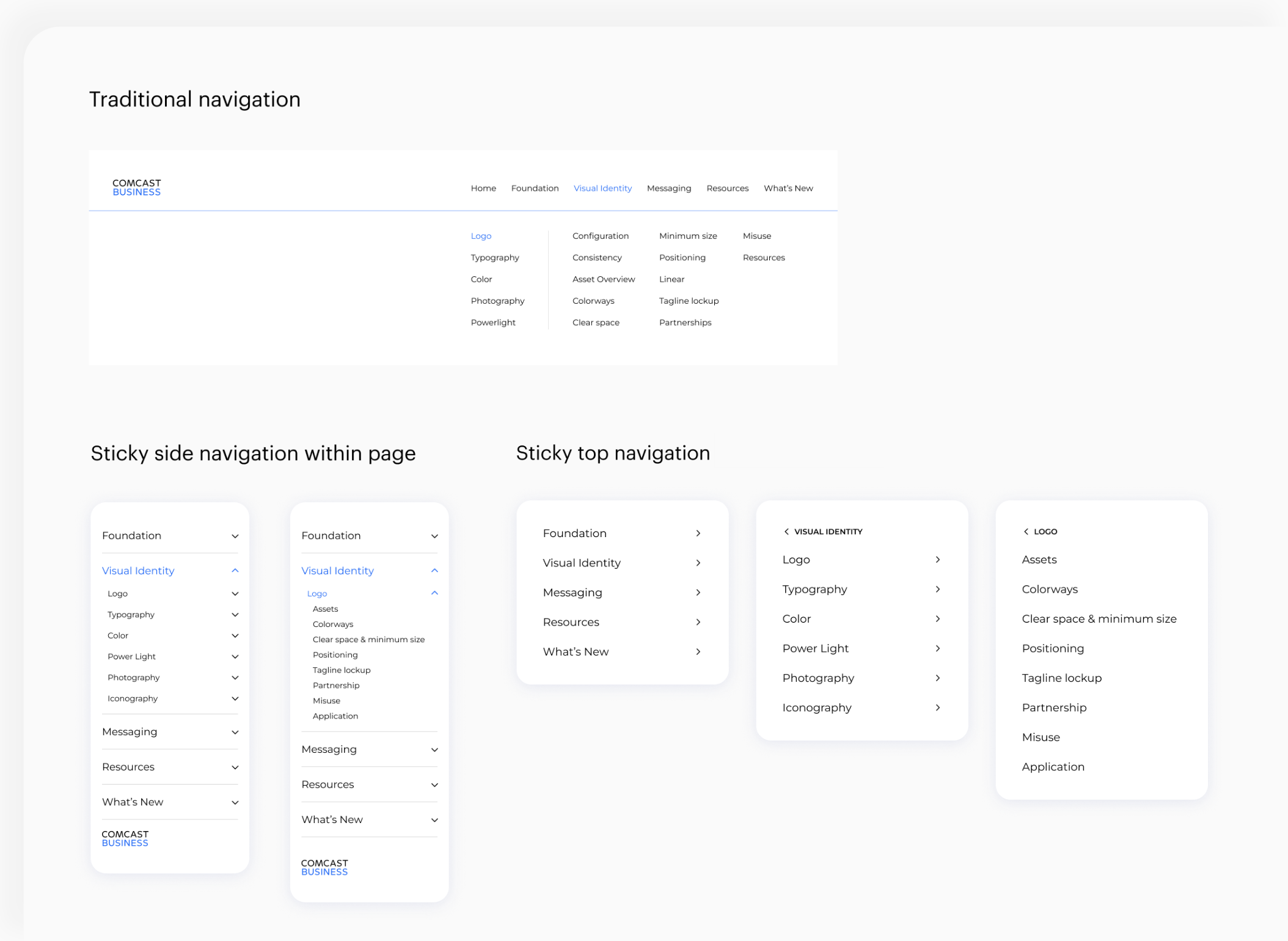
I explored a variety of sticky navigation ideas, and through testing, we found that a sticky top navigation bar worked best. It stayed visible as users scrolled, making it easier to move through the site and stay oriented.
However, even with the sticky navigation in place, I was concerned that users may lose track of their progress on longer pages. To solve this without adding visual clutter, I proposed integrating a progress bar directly into the navigation.
Additionally to support future scalability, I developed a flexible, module-based design system that ensured a smooth handoff to developers. This approach was essential as Comcast aimed to expand its brand guidelines, particularly for the Visual Identity and Messaging pages. By auditing existing content and documentation, I designed adaptable modules that could accommodate new content while maintaining consistency and ease of implementation.


By using a sticky navigation menu with a progress bar and creating a module-based design system, I was able to establish a strong foundation for future content growth while maintaining consistency across Comcast’s expanding brand guidelines.